How to create Instagram Like Animation

Hi there!
A few days ago, while scrolling my Instagram feed I discovered this amazing “Like” animation that happens when you double tap a photo. Though I am not quite a fan of the Instagram app, let me be honest with you — I was quite intrigued by the animation! I’ve recreated the effect and in this article, I’ll show you how to add this “Like” animation in your Flutter project!
Look for the 🧑💻 DartPad blocks in the article. They load an interactive editor right on this page, so you can run and tweak every example without leaving your browser!
What we are building
We will create a single-page app with an image and a Like animation from Instagram. The animation happens in several steps: user double taps a photo, a gradient-filled heart appears, it scales up and flies out of the screen. Sheer elegance!
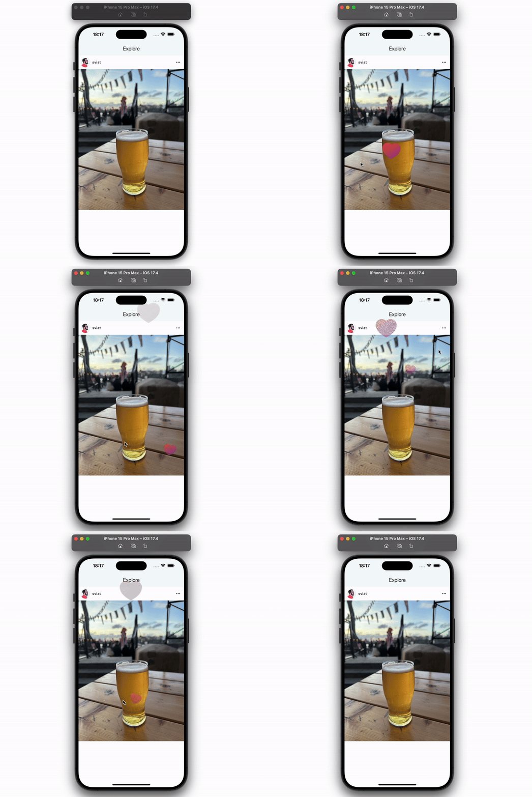 The result we will achieve
So follow along and you’ll have a beautiful heart-popping effect in no time!
The base project
Here is a base project that you can use to start:
There is a bit of UI inside, but nothing works (yet).
The plan
Before adding the Like feature to this base project, we need to get a grasp of these 3 concepts:
- How to detect Double Tap position.
- How to put a Widget over all other widgets
- How to animate a Widget.
Step 1: Detect the double tap position
First of all, a double tap is a gesture. Flutter has a widget for detecting gestures: GestureDetector.
Here is an example of how to use it:
GestureDetector(
  /// a tap's callback
  onTap: () {
    print('it works when you are tapping on the child widget');
  },
  /// a widget which gestures are detected by GestureDetector
  child: Container()
);
Some of the callbacks have additional details, like onTapUp. Most of these details contain gesture positions. Here is an example:
GestureDetector(
  /// onTapUp callback provides details
  onTapUp: (details) {
    print('the tap position is ${details.globalPosition}');
  },
  child: Container(),
);
But as you know we need a position of a double tap, because it’s a gesture Instagram uses to start its Like animation. Sadly there isn’t any Double Tap callback that provides details in GestureDetector. No panic though, it’s easy to create our very own widget for this purpose. I’ve already added DoubleTapDetector to the base project, but if you want to know how it works, I suggest you have a look at this article:
How to get details on onDoubleTap in Flutter
Let’s add DoubleTapDetector to Photo widget:
class Photo extends StatelessWidget {
  const Photo({super.key});

  @override
  Widget build(BuildContext context) => DoubleTapDetector(
        onDoubleTap: (details) => print(details.globalPosition),
        child: Image.network(
          'https://i.postimg.cc/tgxsFtXt/IMG-4368.jpg',
          fit: BoxFit.cover,
        ),
      );
}When you tap on the image (i.e. Photo widget), the position of your tap will be printed.
Step 2: Draw over the whole screen
Now let’s draw a Widget over the Photo (as well as all other widgets). To achieve it, you can use Stack, because Stack is a layout widget that allows you to put one widget over another. Here is an example of how it works:
class ParentWidget extends StatelessWidget {
  const ParentWidget({super.key});
  Widget build(BuildContext context) {
    return Stack(children: [
      /// a widget on the background
      Container(color: Colors.yellow),

      /// a widget in the foreground
      Positioned(
        top: 10,
        left: 10,
        child: Container(
          color: Colors.blue,
          width: 30,
          height: 30,
        ),
      )
    ]);
  }
}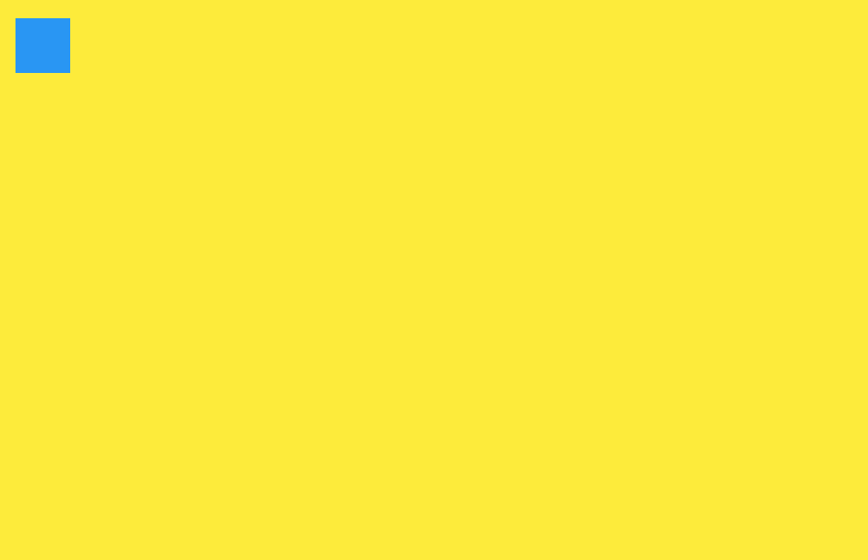 Stack + Positioned
As you can see in this example there is Positioned widget. This is a useful widget that allows you — as the name implies — to position its child at any place in Stack. To determine a position, set the top and left offsets.
However, for this app, we will use Overlay instead of using Stack directly. Why? Overlay allows us to put a widget everywhere on the screen, unlike Stack that only layouts its child widgets. Theoretically we can do it with Stack as well, but that will require wrapping the whole screen in Stack, creating some helper class to add a widget to the Stack and so on and so forth.. Trust me, we’d better stick to Overlay.
Here is an example of how to use overlay:
/// get Overlay from the BuildContext
final overlay = Overlay.of(context);

final widgetThatWeWantToPutInOverlay = Container();

/// create OverlayEntry
final entry = OverlayEntry(
 build: (context) => widgetThatWeWantToPutInOverlay
);

/// add OverlayEntry to Overlay
overlay.insert(entry);

/// remove entry from Overlay
entry.remove();
Pretty simple, isn’t it? Let’s add this to our project. To do that, modify the onDoubleTap callback:
onDoubleTap: (details) {
  /// widget sizes
  const width = 30.0;
  const height = 30.0;

  /// create offsets that place the center of widget
  /// to the center of DoubleTap.

  final left = details.globalPosition.dx - width / 2.0;
  final top = details.globalPosition.dy - height / 2.0;

  final entry = OverlayEntry(
    builder: (context) => Positioned(
      top: top,
      left: left,
      child: Heart(width: width, height: height),
    ),
  );

  Overlay.of(context).insert(entry);
},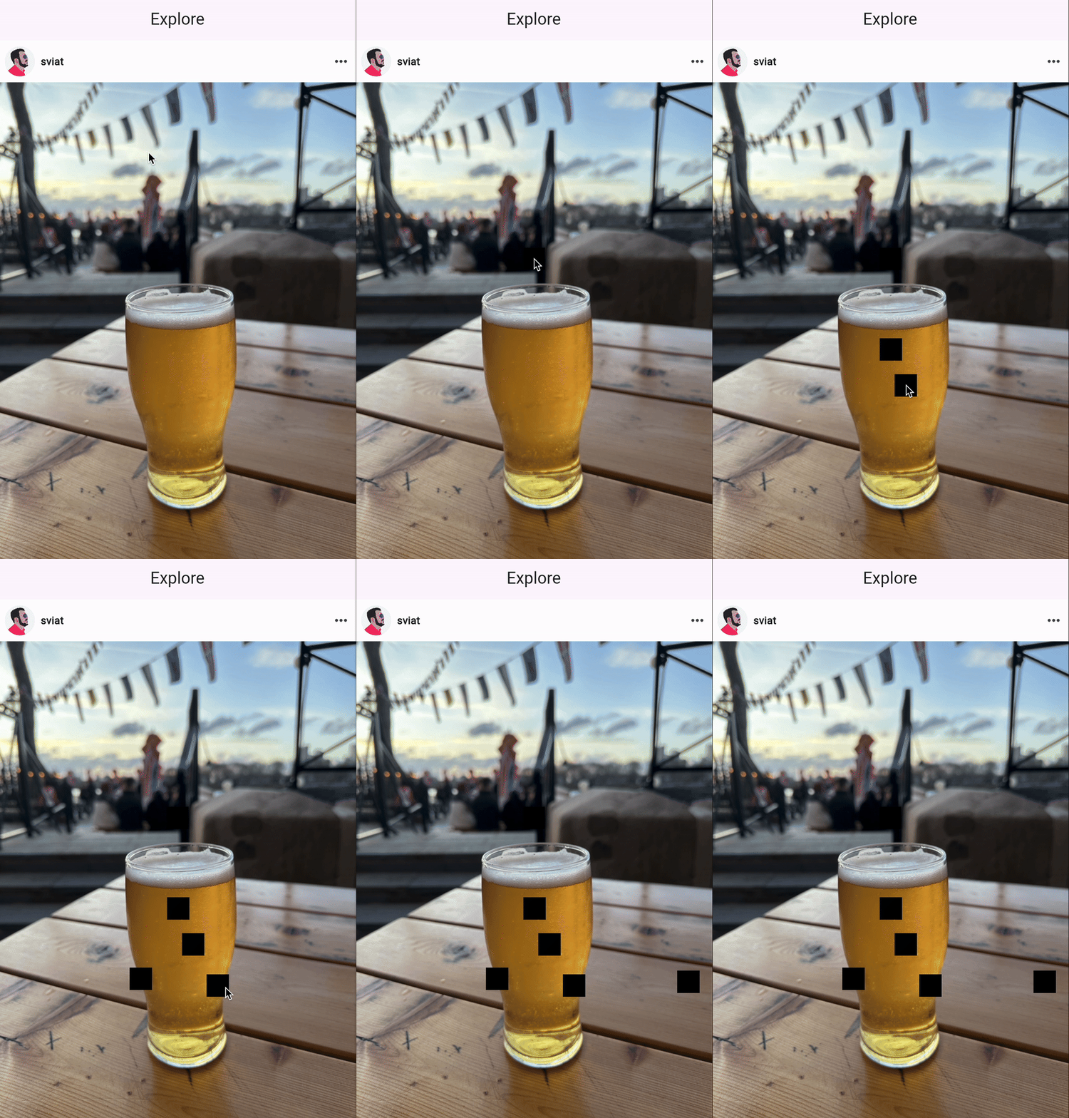 Overlay + Positioned + DoubleTapDetector
Now wherever on the Photo you tap, a black square will pop up immediately!
Step 3: Plan the animation
Before we start implementing the animation, I want to give you a clear description of this animation. Please get familiar with my scheme:
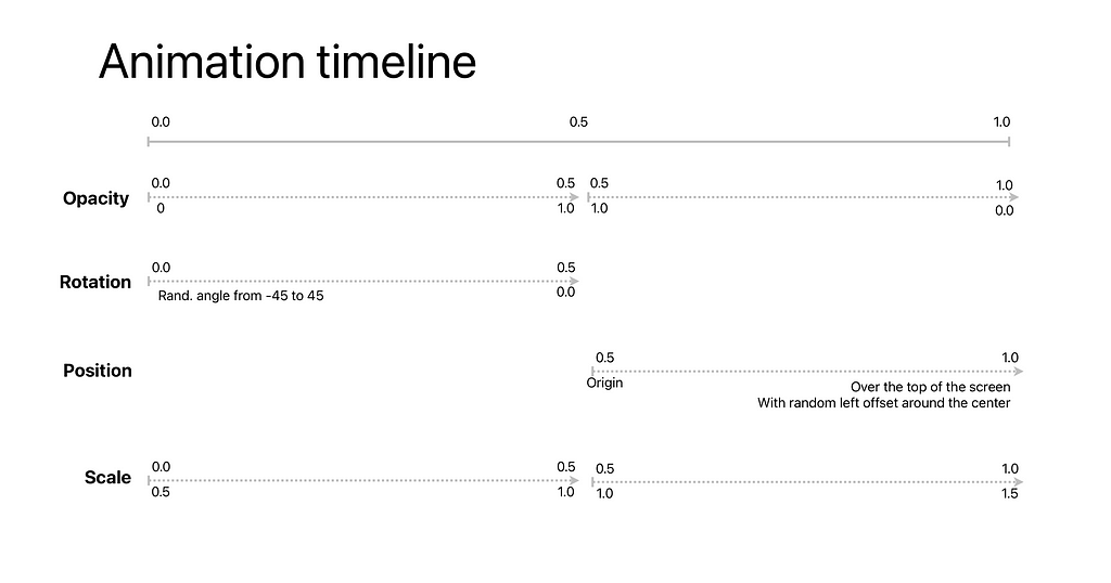
I really like such schemes to describe animations as they are quick to read and easy to understand.
How you should read this:
- The line from 0.0 to 1.0 on the top of the scheme is a timeline of the animation.
- Opacity, Rotation, Position, and Scale at the left side of the scheme are animations that are a part of the main animation.
- Each one has its timeline describing where animation happens (numbers above the line), and the range of values of this animation (numbers below the line).
This scheme is quite useful because it is very close to real Flutter code, and in a moment you will see why.
Step 4: Implement the animation
Our animation is quite complex because it consists of several different animations. For cases like this, AnimationController is one of the best options. Add AnimationController to the project. To do it, we need to create a widget that will work as “an animated heart”. Let’s name it PhotoLike, shall we?
class PhotoLike extends StatefulWidget {
 const PhotoLike({super.key});
 State<PhotoLike> createState() => _PhotoLikeState();
}

class _PhotoLikeState extends State<PhotoLike> {
 Widget build(BuildContext context) => const Heart();
}
Now let’s add AnimationController to _PhotoLikeState and initialize it.
class _PhotoLikeState extends State<PhotoLike> with SingleTickerProviderStateMixin {
 /// the main animation duration
 static const _animationDuration = Duration(seconds: 1);

 late final AnimationController _controller;

 void initState() {
  super.initState();
  // initalizing in initState because
  // AnimationController needs TickerProvider
  // that is _PhotoLikeState
  _controller = AnimationController(
   vsync: this,
   duration: _animationDuration,
  );
 }

 void dispose() {
  // it's important to dispose AnimationController
  // when it is not needed
  // in our case it on _PhotoLikeState.dispose()
  _controller.dispose();
  super.dispose();
 }

 Widget build(BuildContext context) => const Heart();
}
The code has got some comments, but there are a few things that I need to emphasize.
How animation works
Animation is an illusion of motion. If a set of static images changes fast enough, they produce this illusion.
Modern screens support 120hz (that means they can change an image 120 times per second). In my opinion, this is a golden standart of frequency that provides smooth animation for the time being. If we want to have this level of smoothness in Flutter, we need to update the widgets tree based off frame changes. In Flutter, a class that can call callbacks on every frame is Ticker. AnimationController uses TickerProvider to get Ticker which AnimationController uses to update an animation value.
In the souce code above, _PhotoLikeState is TickerProvider as it implements SingleTickerProviderStateMixin.
Opacity
Now, let’s try to animate opacity with AnimationController. To do it, let’s add Opacity to _PhotoLikeState build method and start the animation in initState():
void initState() {
    super.initState();
    _controller = AnimationController(
      vsync: this,
      duration: const Duration(seconds: 1),
    );

    _controller.addListener(() {
      setState(() {});
    });

    _controller.forward();
  }

  @override
  Widget build(BuildContext context) => Scaffold(
        backgroundColor: Colors.white,
        body: Center(
          child: Opacity(
            opacity: _controller.value,
            child: Container(
              color: Colors.black,
              width: 100,
              height: 100,
            ),
          ),
        ),
); Opacity + AnimationController.value
As you can see here, we added a listener to AnimationController to update state when AnimationController updates. Then, we started animation by calling _controller.forward(). In build method we use _controller.value as opacity in Opacity widget.
But what is the animation value?
Animation value is a value that represents an animation progress. It lies in the range between 0.0 and 1.0 (remember this timeline in the scheme above?). AnimationController calculates this value based off Duration and FPS of the screen your device has. So, for example, if your screen can show 120 FPS and your animation Duration is 1 second, AnimationController will update animation value every frame + 0.008. That means you will see 120 widgets with different Opacity that your brain will recognize as motion. Easy :).
While the animation in the previous example works, the Like animation is even more complex. As you can see on the scheme there are 4 different animations with even more different ranges.
Someone might say: “Okay, so we need to do some math that maps AnimationController.value to the value we need”. It’s true indeed, but wouldn’t it be better if we use excisting solutions instead of reinventing a wheel?
To animate the opacity value from 0.0 to 1.0 and from 1.0 to 0.0, we need to use Tween.
Tween is a liner interpolation between begin and end. That means Tween calculates a needed value for animation by the current animation value.
Here is an example of how it works:
final tween = Tween<double>(begin: 1, end: 100);

/// ( the middle of animation timeline )
double currentAnimationValue = 0.5;
print(tween.lerp(currentAnimationValue)); /// prints 50

currentAnimationValue = 0.8;
print(tween.lerp(currentAnimationValue)); /// prints 80

currentAnimationValue = 1.0;
print(tween.lerp(currentAnimationValue)); /// prints 100
As you can see Tween can map any value that is provided by AnimationController to a value which coressponds with Tween. To create more complex Tweens, there are additional classes: TweenSequence and TweenSequenceItem. TweenSequence is a class that combines Tweens and use their result in serial.
TweenSequenceItem is an item of TweenSequence that contains Tween and weight. Weight defines a percentage of duration. For example, if you put two TweenSequenceItems with the same weights, the first one will be used from 0.0 to 0.5 and the second one will be used from 0.5 to 1.0.
Let’s create TweenSequence that maps animation value as it is described in the scheme for Opacity:
const appear = Tween<double>(begin: 0.0, end: 1.0);

const disappear = Tween<double>(begin: 1.0, end: 0.0);

const sequence = TweenSequence<double>([
 TweenSequenceItem(tween: appears, weight: 50),
 TweenSequenceItem(tween: disappear, weight: 50),
]);
Now we have the TweenSequence that maps _controller animation to the opacity value that we need.
It’s time to add a new animation to _PhotoLikeState:
  late final AnimationController _controller;
  late final Animation<double> _opacity;

  void initState() {
    super.initState();
    _controller = AnimationController(
      vsync: this,
      duration: const Duration(seconds: 2),
    );

    _controller.addListener(() {
      setState(() {});
    });

    final appear = Tween<double>(begin: 0.0, end: 1.0);
    final disappear = Tween<double>(begin: 1.0, end: 0.0);

    final sequence = TweenSequence<double>([
     TweenSequenceItem(tween: appear, weight: 50),
     TweenSequenceItem(tween: disappear, weight: 50),
    ]);

    /// create an animation with _controller as a parent animation
    _opacity = sequence.animate(_controller);

    _controller.forward();
  }

  @override
  Widget build(BuildContext context) => Scaffold(
        backgroundColor: Colors.white,
        body: Center(
          child: Opacity(
            opacity: _opacity.value,
            child: Container(
              color: Colors.black,
              width: 100,
              height: 100,
            ),
          ),
        ),
      );
} Opacity + Animation + Tween + TweenSequence
In this code, we created a new animation _opacity controlled by AnimationController that means value of opacity changes when AnimationController value changes. But unlike _controller.value, _opacity.value is in range 0.0 -> 1.0 -> 0.0.
Scale
Let’s implement scale animation the same way:
  late final AnimationController _controller;

  late final Animation<double> _scale;

  void initState() {
    super.initState();
    _controller = AnimationController(
      vsync: this,
      duration: const Duration(seconds: 2),
    );

    _controller.addListener(() {
      setState(() {});
    });

    final sequence = TweenSequence<double>([
      TweenSequenceItem(tween: Tween(begin: 0.5, end: 1.0), weight: 50),
      TweenSequenceItem(tween: Tween(begin: 1.0, end: 1.5), weight: 50),
    ]);

    /// create an animation with _controller as a parent animation
    _scale = sequence.animate(_controller);

    _controller.forward();
  }

  @override
  Widget build(BuildContext context) => Scaffold(
        backgroundColor: Colors.white,
        body: Center(
          child: Transform.scale(
            scale: _scale.value,
            child: Container(
              color: Colors.black,
              width: 100,
              height: 100,
            ),
          ),
        ),
); Transform.scale + TweenSequence + Tween
Here we used Transform.scale to change the size of a child Widget. Quite similar to Opacity, except for the different ranges Tweens have.
Rotation
Look at the scheme once again, Rotation is a slightly different step. Rotation animation starts from 0.0 to 0.5 of the main animation timeline and does nothing after that. Doing nothing means the animation value doesn’t change after that.
late final AnimationController _controller;

  late final Animation<double> _rotation;

  void initState() {
    super.initState();
    _controller = AnimationController(
      vsync: this,
      duration: const Duration(seconds: 2),
    );

    _controller.addListener(() {
      setState(() {});
    });

    // a random angle of +- 45 degrees
    final beginAngle = Random.secure().nextDouble() - 0.5;

    const endAngle = 0.0;

    final sequence = TweenSequence<double>([
      TweenSequenceItem(
        tween: Tween(begin: beginAngle, end: endAngle),
        weight: 50,
      ),
      TweenSequenceItem(
        tween: ConstantTween(endAngle),
        weight: 50,
      ),
    ]);

    /// create an animation with _controller as a parent animation
    _rotation = sequence.animate(_controller);

    _controller.forward();
  }

  @override
  Widget build(BuildContext context) => Scaffold(
        backgroundColor: Colors.white,
        body: Center(
          child: Transform.rotate(
            angle: _rotation.value,
            child: Container(
              color: Colors.black,
              width: 100,
              height: 100,
            ),
          ),
        ),
); Transform.rotate + TweenSequence + Tween
Here’s how the angle is changing its value randomly in a range between -45 and 45 degrees (-0.5 to 0.5). As you can see we used ConstantTween to create a Tween that returns the same result.
Position
Position animation can be created with the same classes that we used before, but there is one problem. The heart should appear at the place where the user tapped but then it should fly out of the screen. We need to know the distances and mind screen bounds.
To move the Widget out of the screen, we will use Transform.translate. It moves a child Widget with the given Offset. Let’s do some calculations:
Top offset calculations:
// animation should start from the current widget position
final beginTopOffset = 0.0;

/// it ends above the top of the screen. It means the top offset should be equal to
final endTopOffset = -widget._position.dy
Left offset calculations:
// animation should start from the current widget position
final beginLeftOffset = 0.0;

// endLeft is random point between the wiget current position
// the center of the screen
// get screen width:
final screenWidth = MediaQuery.of(context).size.width;

// get the centre point
final centerX = screenWidth / 2.0;

// get the distance between the centre of the screen and the widget position.
final distance = centerX - widget._position.dx;

// multiply distance with a random number between 0.0 and 1.0
final randomPoint = distance * Random.secure().nextDouble();

final endLeftOffset = randomPoint;
And now we bump into this issue: we can’t use context in void initState() and we lack some data to make Tween. However, we can create Tween without the end argument and set it later (when we will have all the necessary info).
As you may know, we can use context in two places of State<StatefulWidget>:
- Widget build(BuildContext context) not preferable except for building widgets tree.
- void didChangeDependencies() — the very place where it should be done, because MediaQuery is a dependency we need.
So let’s put the calculations to void didChangeDependencies() and create the position animation.
late final AnimationController _controller;

  late final Animation<Offset> _position;
  late final Tween<Offset> _positionTween;

  void initState() {
    super.initState();

    _controller = AnimationController(
      vsync: this,
      duration: const Duration(seconds: 2),
    );

    _controller.addListener(() {
      setState(() {});
    });

    _positionTween = Tween(begin: Offset.zero);

    final sequence = TweenSequence<Offset>([
      TweenSequenceItem(
        tween: ConstantTween(Offset.zero),
        weight: 50,
      ),
      TweenSequenceItem(
        tween: _positionTween,
        weight: 50,
      ),
    ]);

    /// create an animation with _controller as a parent animation
    _position = sequence.animate(_controller);

    _controller.forward();
  }

  void didChangeDependencies() {
    super.didChangeDependencies();
    final screenWidth = MediaQuery.of(context).size.width;
    final screenCenter = screenWidth / 2.0;

    final distance = widget._position.dx - screenCenter;
    final leftOffset = distance * Random.secure().nextDouble();

    final topOffset = widget._position.dy;

    _positionTween.end = Offset(topOffset, leftOffset);
  }

  @override
  Widget build(BuildContext context) => Scaffold(
        backgroundColor: Colors.white,
        body: Stack(
          children: [
            Positioned(
              top: widget._position.dy,
              left: widget._position.dx,
              child: Transform.translate(
                offset: _position.value,
                child: Container(
                  color: Colors.black,
                  width: 100,
                  height: 100,
                ),
              ),
            ),
          ],
        ),
); Transform.translate + Tween + TweenSequence
Combining all animations
Whew! The previous examples show each animation seperately. Let’s modify original project and combine them all.
The listing is too long to add to the article, so run it right here:
💾 Link to source code in Github
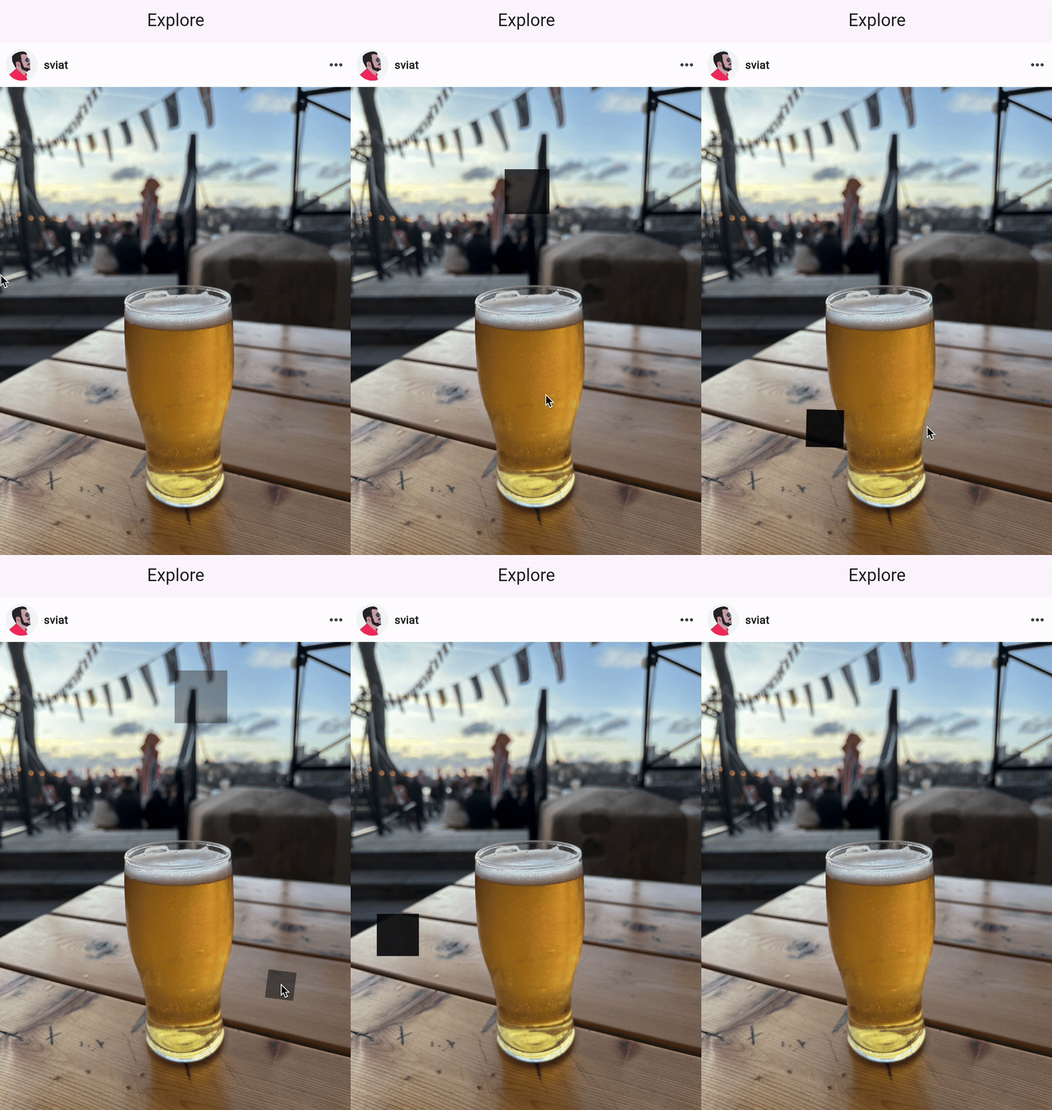
Step 5: Hearts
In the previous step, we did the animation but it was a black square that we animated! And, to be honest, you can leave it as it is if you appreciate Malevich more than Instagram.
Though to wrap it all up, here is the code to replace the black square with the heart:
class Heart extends StatelessWidget {
  const Heart({
    super.key,
    Size? size,
  }) : _size = size;

  final Size? _size;

  @override
  Widget build(BuildContext context) {
    return CustomPaint(
      painter: const HeartPainter(),
      size: _size ?? Size.zero,
    );
  }
}

class HeartPainter extends CustomPainter {
  const HeartPainter({this.stockWidth = 5});

  final double stockWidth;

  @override
  void paint(Canvas canvas, Size size) {
    final paint = Paint()
      ..style = PaintingStyle.fill
      ..shader = const LinearGradient(
        colors: [Colors.red, Colors.purple],
        stops: [0.2, 1],
        transform: GradientRotation(0.3 * 3.14),
      ).createShader(Rect.fromLTWH(0, 0, size.width, size.height));

    final path = createHeartShapePath(size);

    canvas.drawPath(path, paint);
  }

  @override
  bool shouldRepaint(covariant CustomPainter oldDelegate) => true;

  static Path createHeartShapePath(Size size) {
    return Path()
      ..moveTo(size.width / 2, size.height * 0.35)
      ..cubicTo(0.2 * size.width, size.height * 0.1, -0.25 * size.width,
          size.height * 0.6, 0.5 * size.width, size.height)
      ..cubicTo(1.25 * size.width, size.height * 0.6, 0.8 * size.width,
          size.height * 0.1, size.width / 2, size.height * 0.35)
      ..close();
  }
}
The result
By the way, Heart is a custom-painted widget and if you want to know how create one, let me kindly suggest this read:
How to draw a custom icon in Flutter
Wrapping up
Congratulations! Now you’ve learnt Animation basics, what is AnimationController, how to combine Tween, how to animate widgets and most importantly how to create Instagram-like animation ❤️!
If you want to know more about Flutter and software development in general, subscribe to the RSS feed and stay tuned.
Also, you can follow me on Instagram!
📷 https://www.instagram.com/s.s.kliuchev/
No idea why on Earth you’d want to do that, but since this article is all about Instagram, don’t hold yourself back :)
For those of you eager to learn and know more about animation, I highly recommend these links:
- Read official documentation about all widgets and classes that we’ve used in this article: AnimationController, AnimatedBuilder, Transform, Tween, TweenSequence, TweenSequenceItem, FadeTransition.
- Introduction to animations
- Watch this video Flutter Europe: Animations in Flutter done right
- And read my next articles because some of them will describe animation more :).
Stay tuned gang!